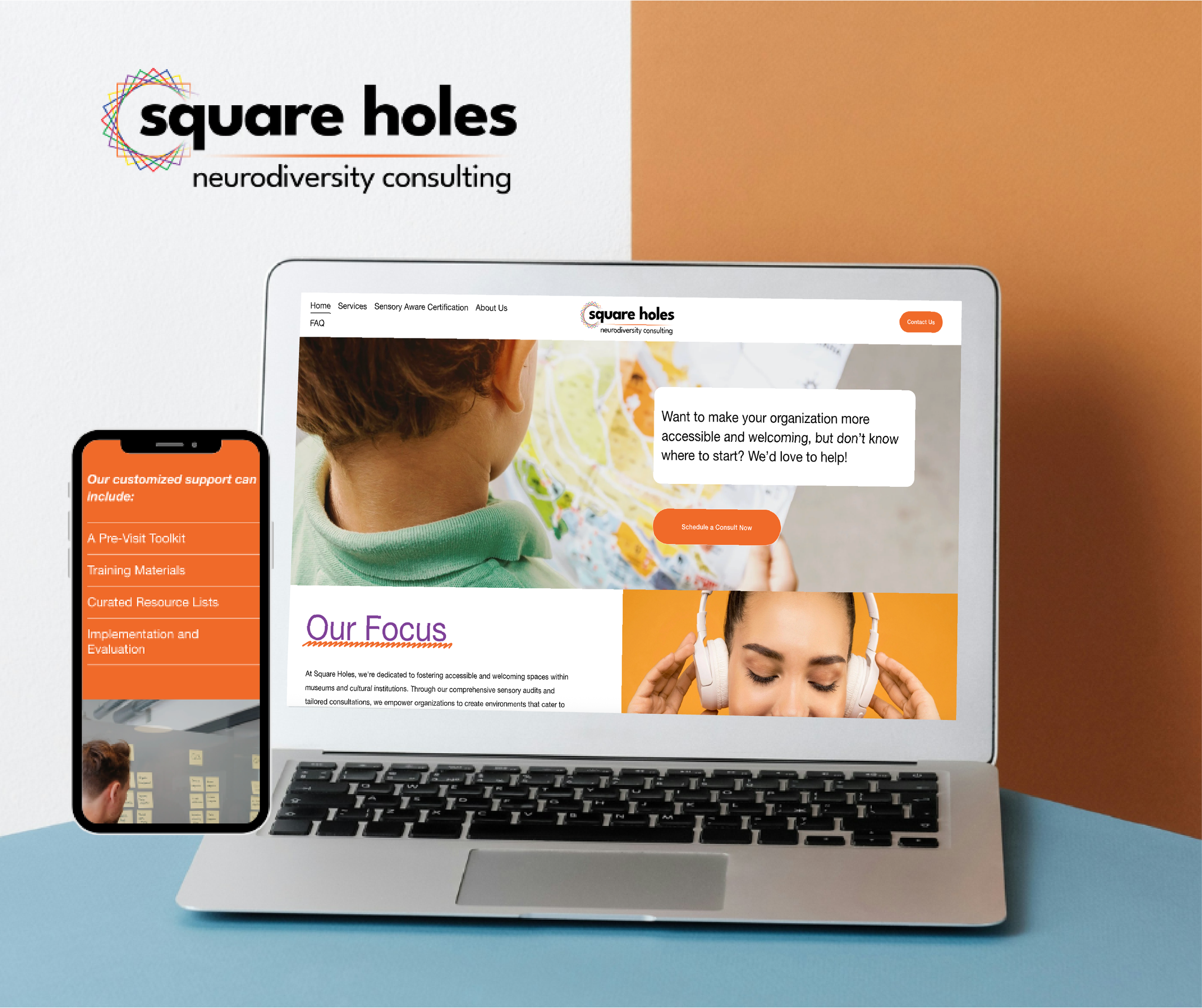
Square Holes
Case Study
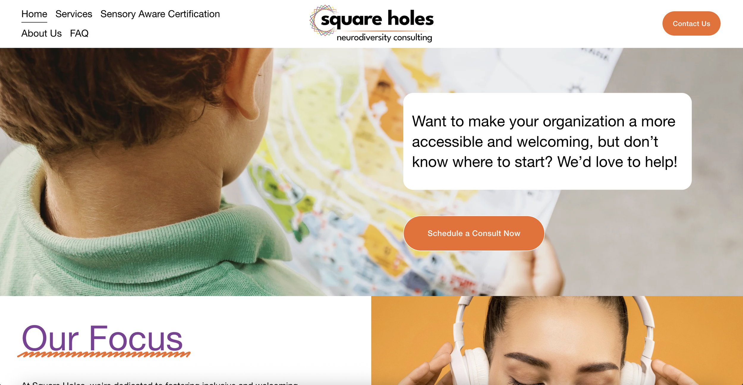
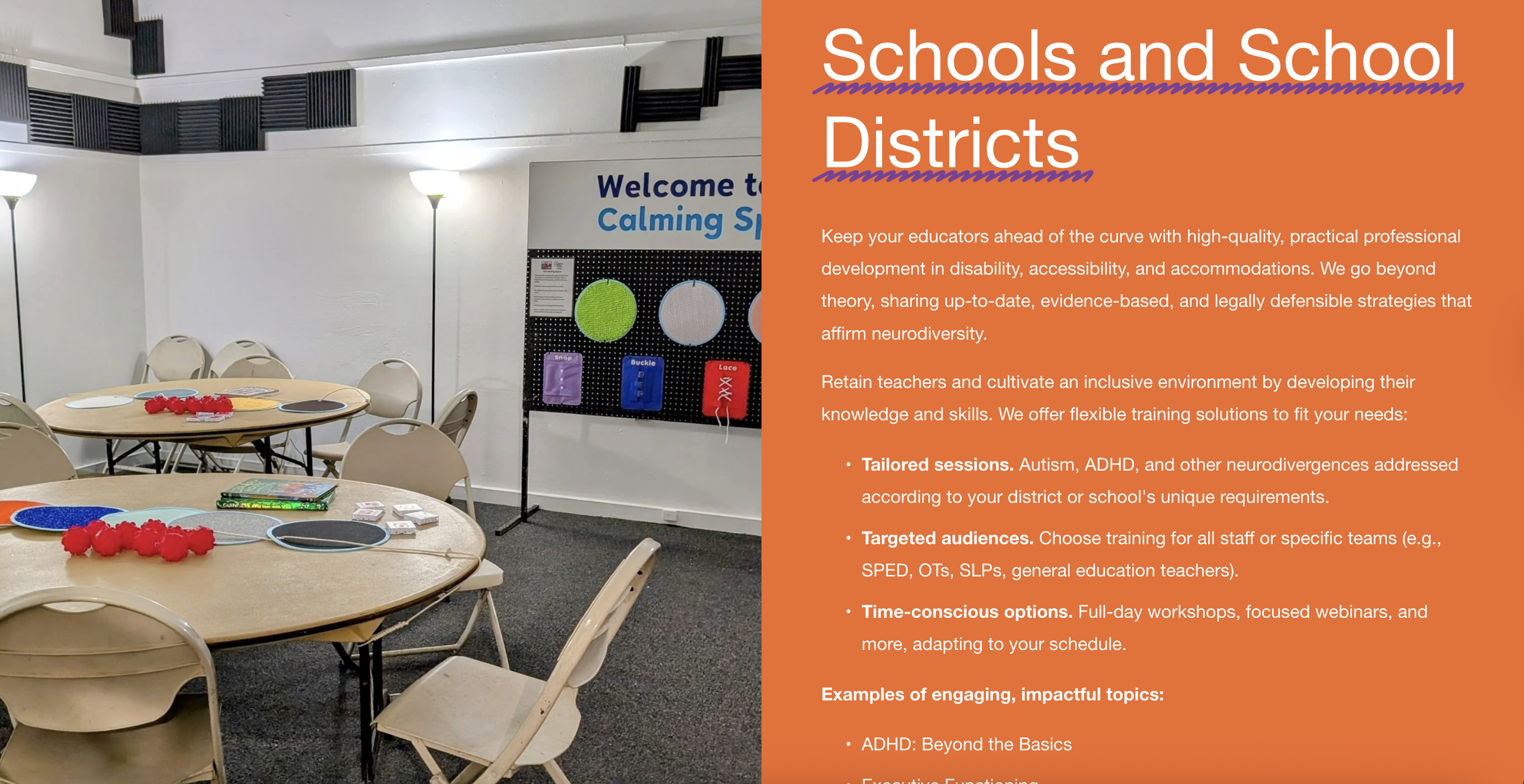
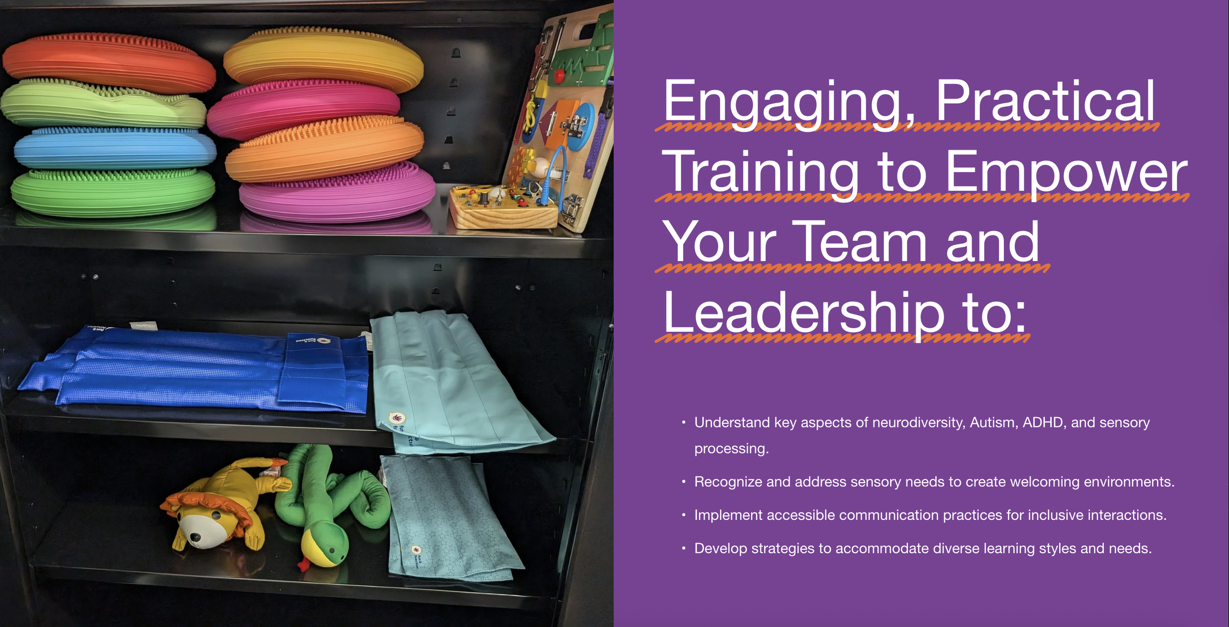
Square Holes came to me with an existing site that had done its job — but had aged out of their brand's current identity. The goal wasn't a rebuild from scratch. It was a smart, targeted redesign that modernized the look, improved clarity around their services, and matched the site to where the brand actually was.
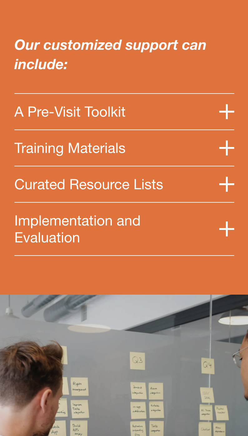
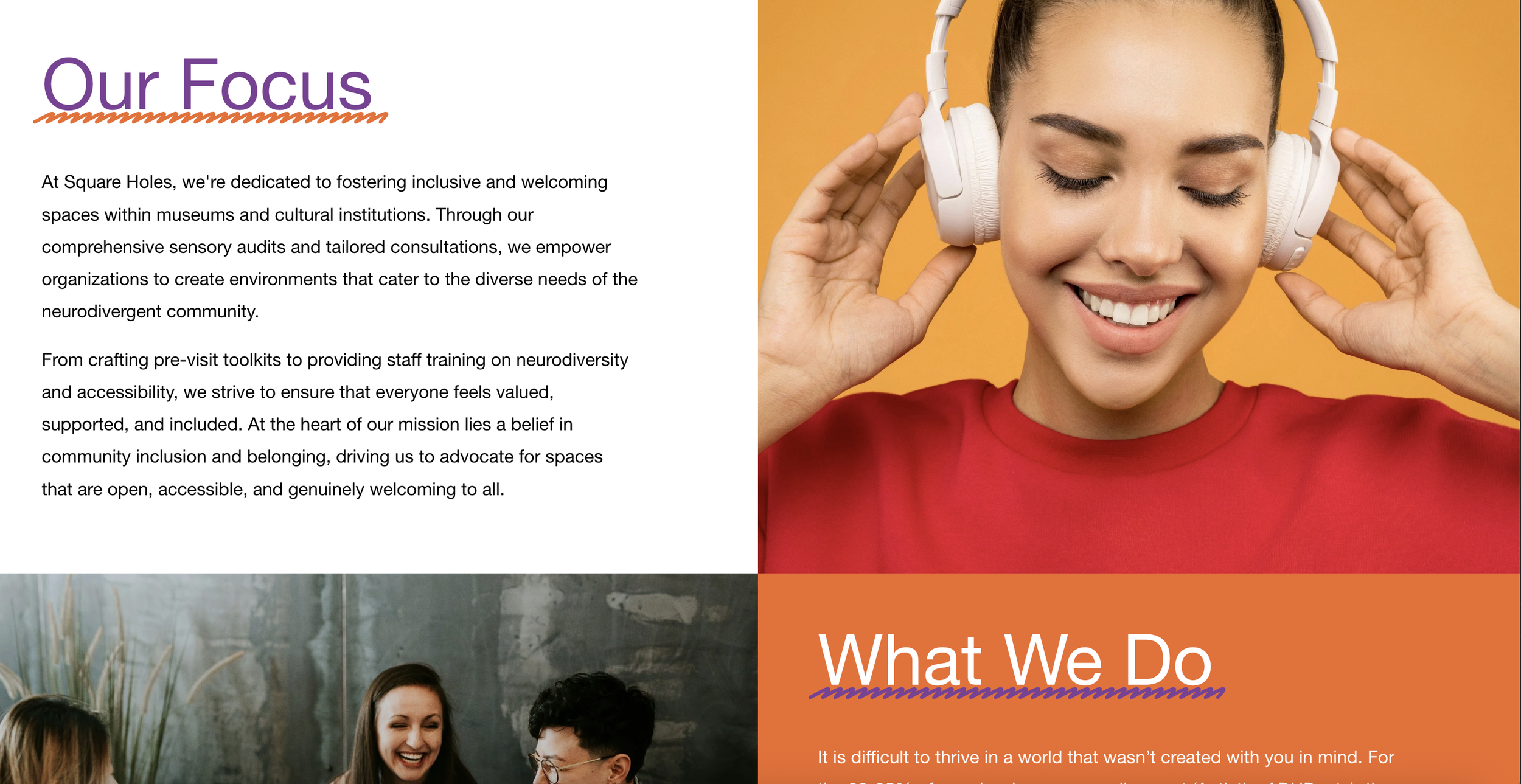
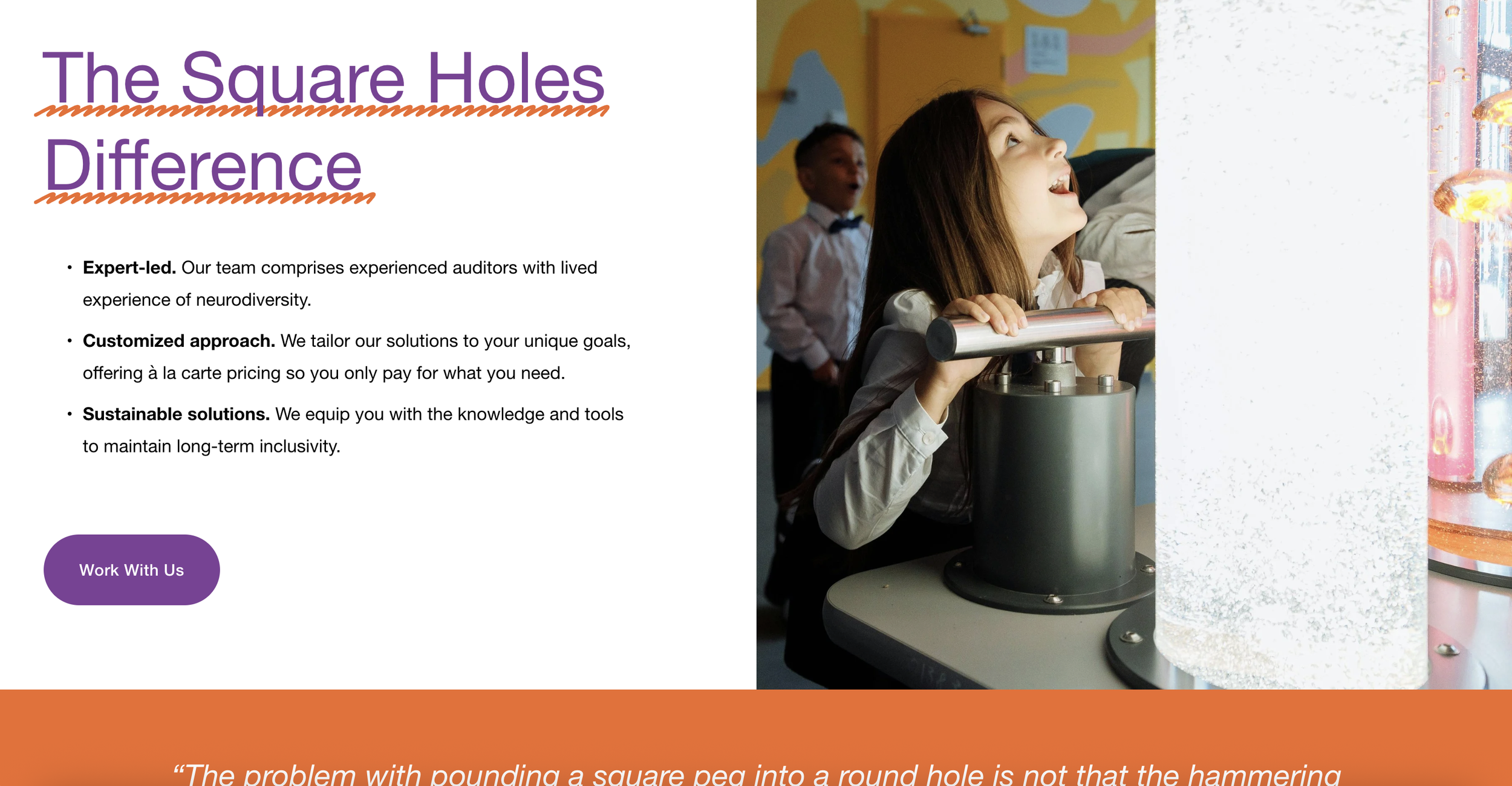
The redesign focused on tightening the layout for better scannability, updating typography and spacing to feel more current, and restructuring the content so visitors could immediately understand what Square Holes offers and why it matters. The visual direction was anchored to their existing logo so the site felt like an evolution rather than a departure — consistent, credible, and clean.
The result is a site that finally looks like the business it represents: sharp, professional, and easy to navigate.